Greater Sydney Parklands is the NSW Government agency responsible for parks including Centennial, Parramatta, and Western Sydney Parklands — but until this project, it had no website of its own. Its work and identity were dispersed across the individual park sites, with nowhere for the agency itself to live online.
The challenge had two layers. The first was establishing an agency-level identity that didn't compete with the parks it manages. The second was quieter: the brand guidelines existed but were built for print. No digital palette, no tints, no shades. Accessibility compliant design had to be invented within the brand, not added on top of it.
I led the UX and UI end-to-end, working with stakeholders to shape both the content and the visual system.
Brand expansion — digital tints and shades derived from the print palette, balancing accessibility with brand fidelity
Stakeholder co-design — workshops with key stakeholders to surface content needs, audience priorities, and agency objectives
Design system — atomic methodology, with WCAG 2.2 AA designed in from the start

The agency had no prior digital presence, so there was no existing site to react to — the content, structure, and priorities had to come from the people who run the parklands. I ran engagement workshops to surface content needs, audience priorities, and agency objectives directly, rather than designing on assumptions.

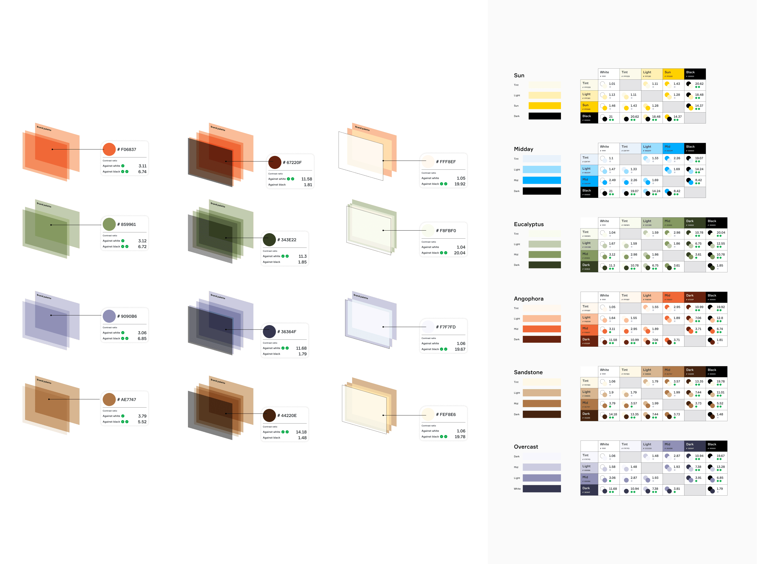
The brand guidelines lacked the tints, shades, and contrast ratios needed for accessible digital design. Rather than treat this as a constraint, I treated it as scope — expanding the palette while staying loyal to the brand.
The result added visual hierarchy and depth across the site without compromising agency identity or AA contrast.

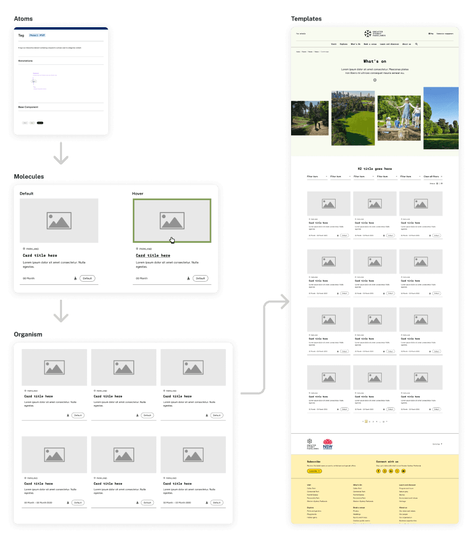
The site needed to be maintainable by a small in-house team after launch. Atomic design gave us a system where components were small, reusable, and predictable — easier to update without breaking other parts of the site.
Why I use the atomic design approach?
Modularity and efficiency — a modular approach streamlines the maintenance and updates of UI components.
Reusability and consistency — components are designed for reuse, ensuring a consistent look and feel throughout the design.
Scalability — atomic design system can scale with the growth of the website, while maintaining consistency