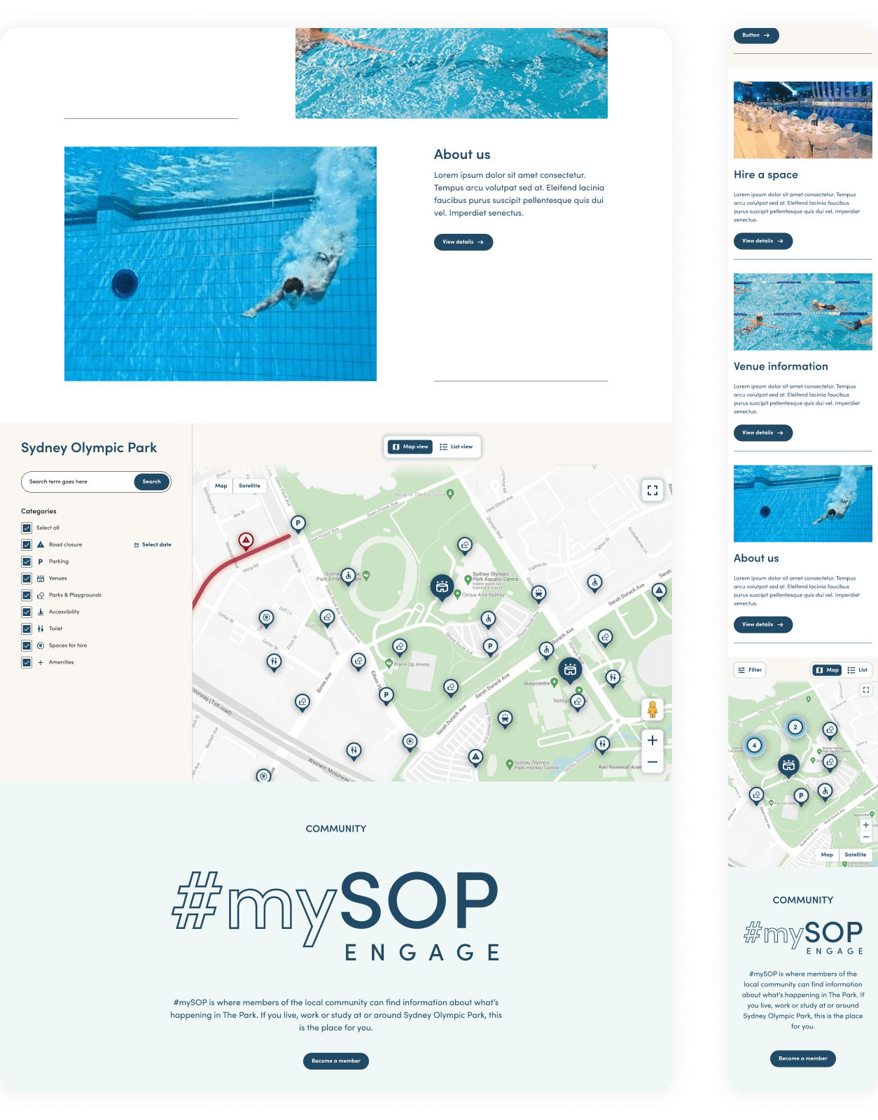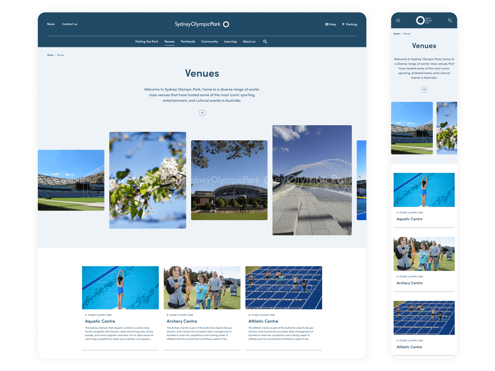
The Sydney Olympic Park Authority managed seven separate websites — one for each venue across the precinct — each with its own navigation, brand expression, and content structure. Visitors planning a day at the park, parents looking for a swim lesson, and event organisers scoping a venue all had to hop between sites with no sense they belonged to the same place.
The real challenge wasn't making it look consistent. It was structuring the information so different audiences could each feel the site was built for them, without fragmenting the Sydney Olympic Park brand.
As the lead UX/UI designer, my work spanned UI design through to a production-ready design system:
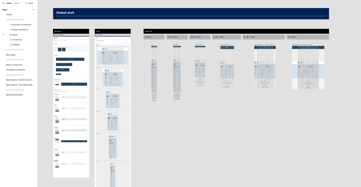
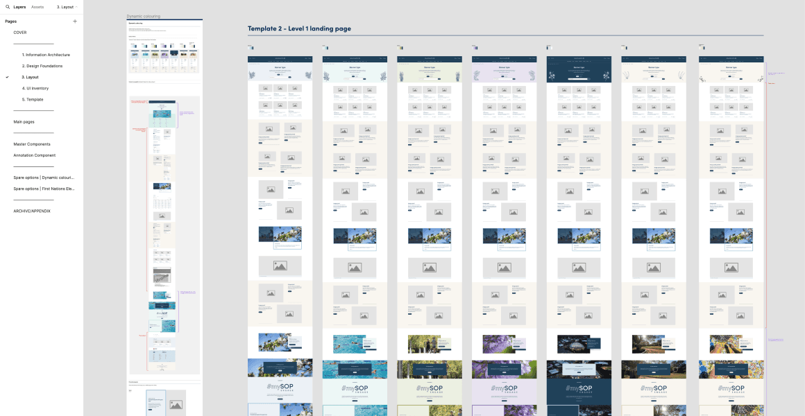
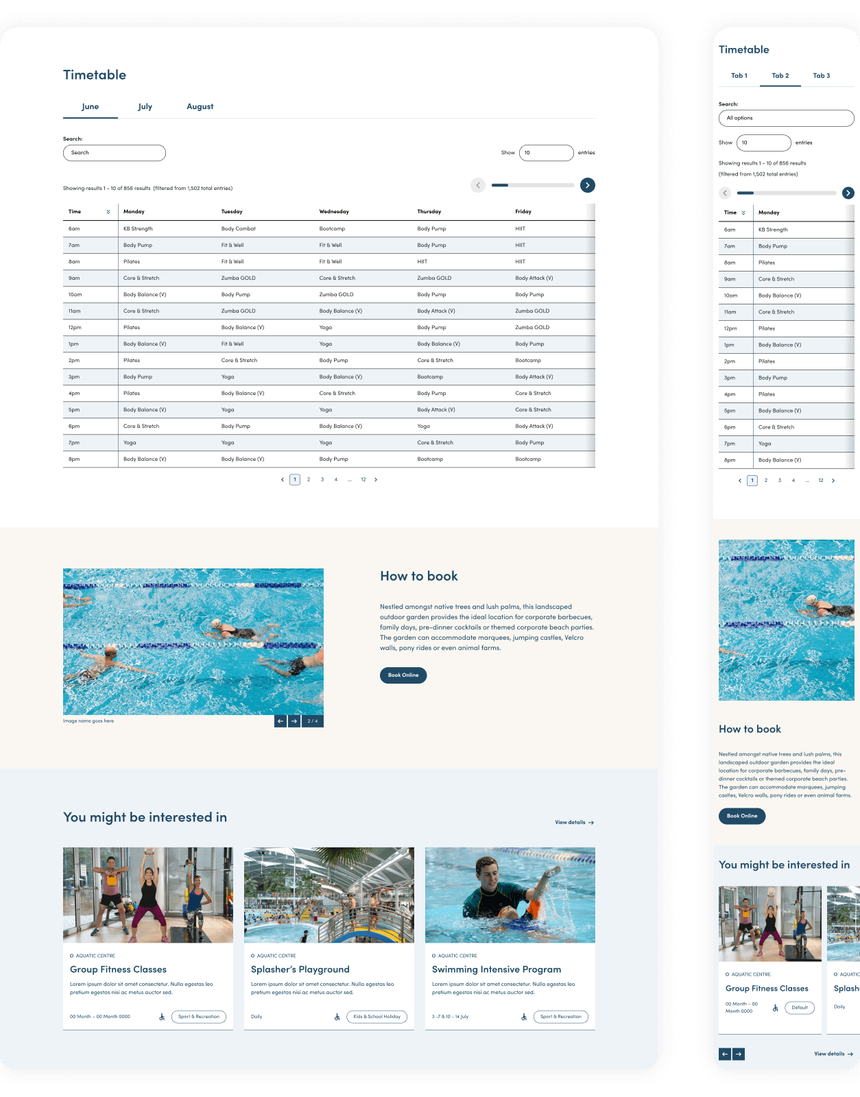
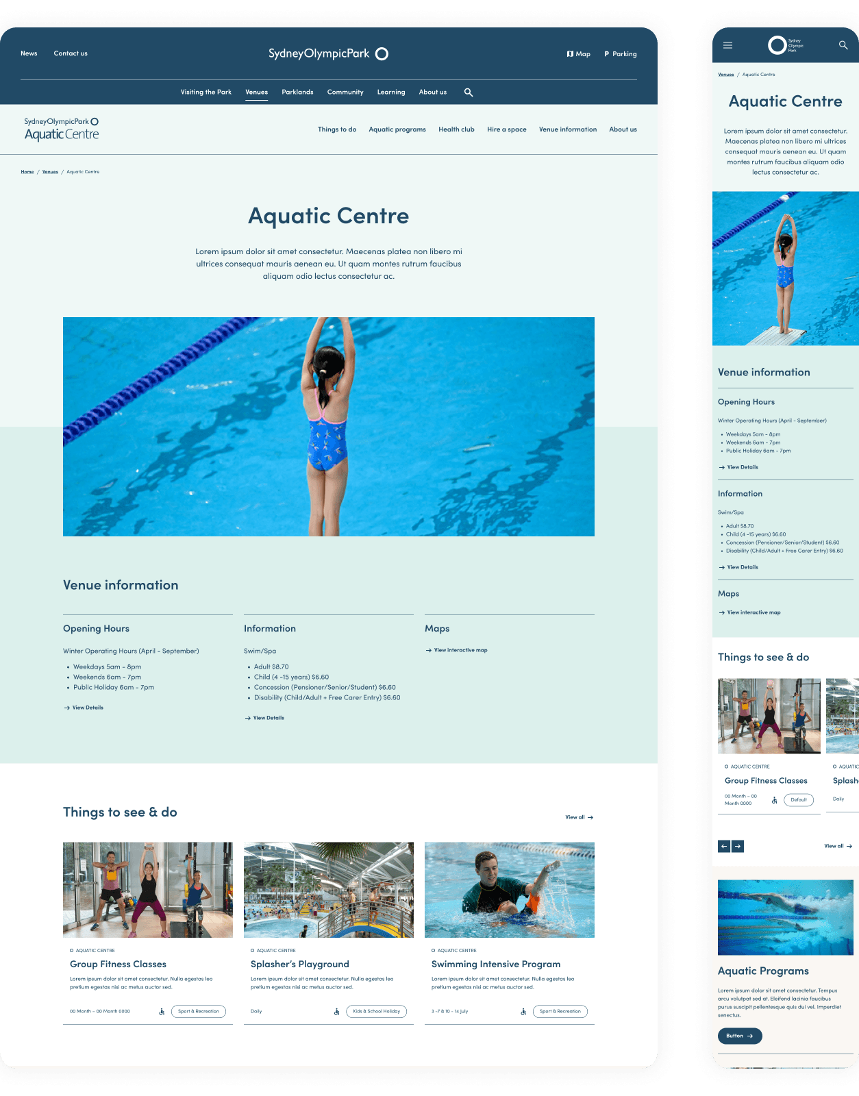
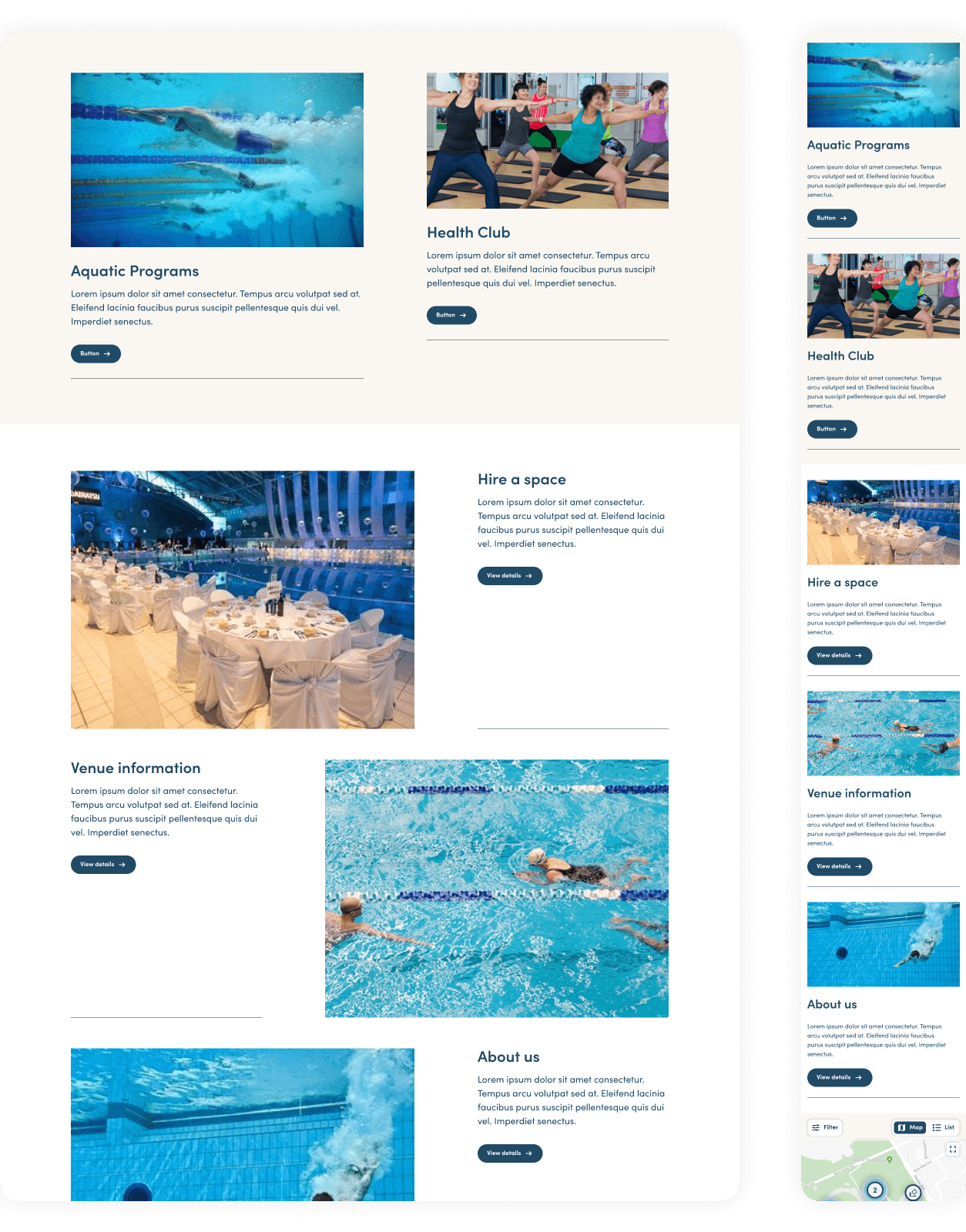
UI design — a visual language consistent across the precinct, with room for individual venue identity
Usability validation — moderated testing sessions with external customers
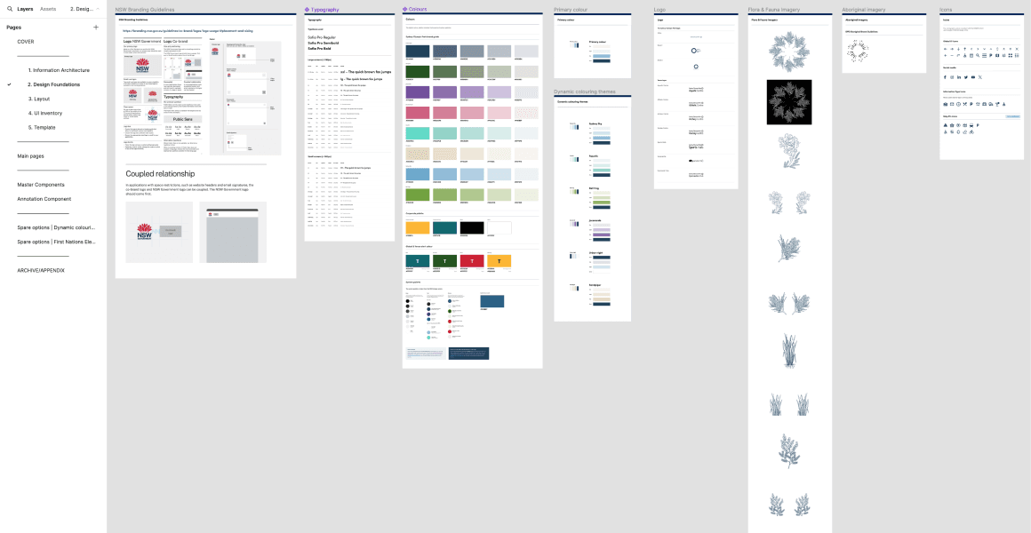
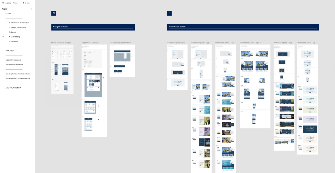
Design system — built on the atomic methodology, modular enough to support venue-specific pages
Accessibility — WCAG 2.2 AA designed into every component from the start

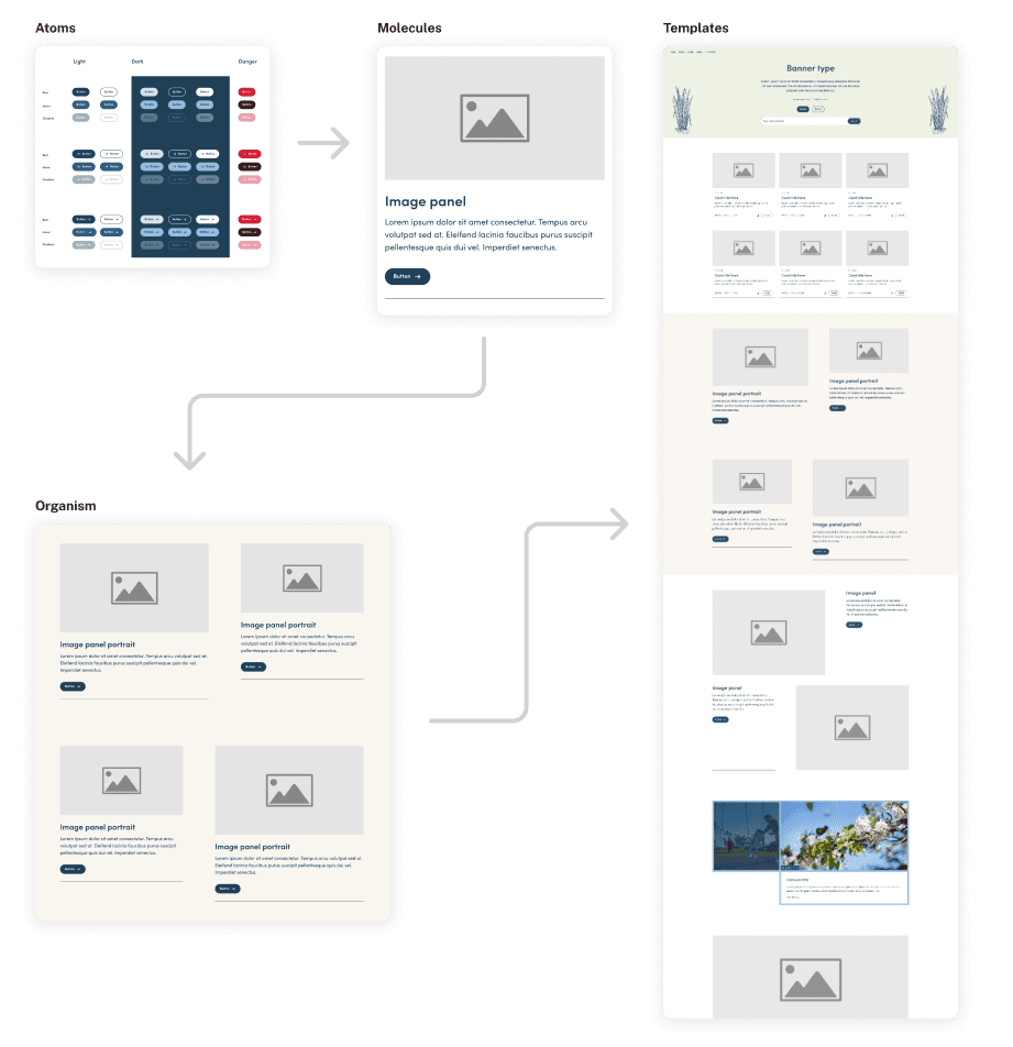
Atomic design as the structural methodology. Working from atoms up through templates kept the system modular enough to support venue-specific pages while ensuring consistency across the precinct.
Why I use the atomic design approach?
Modularity and efficiency — a modular approach streamlines the maintenance and updates of UI components.
Reusability and consistency — components are designed for reuse, ensuring a consistent look and feel throughout the design.
Scalability — atomic design system can scale with the growth of the website, while maintaining consistency